

COVILHA, PORTUGUESE CULTURAL CAPITAL CITY
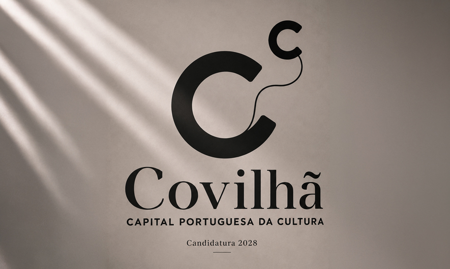
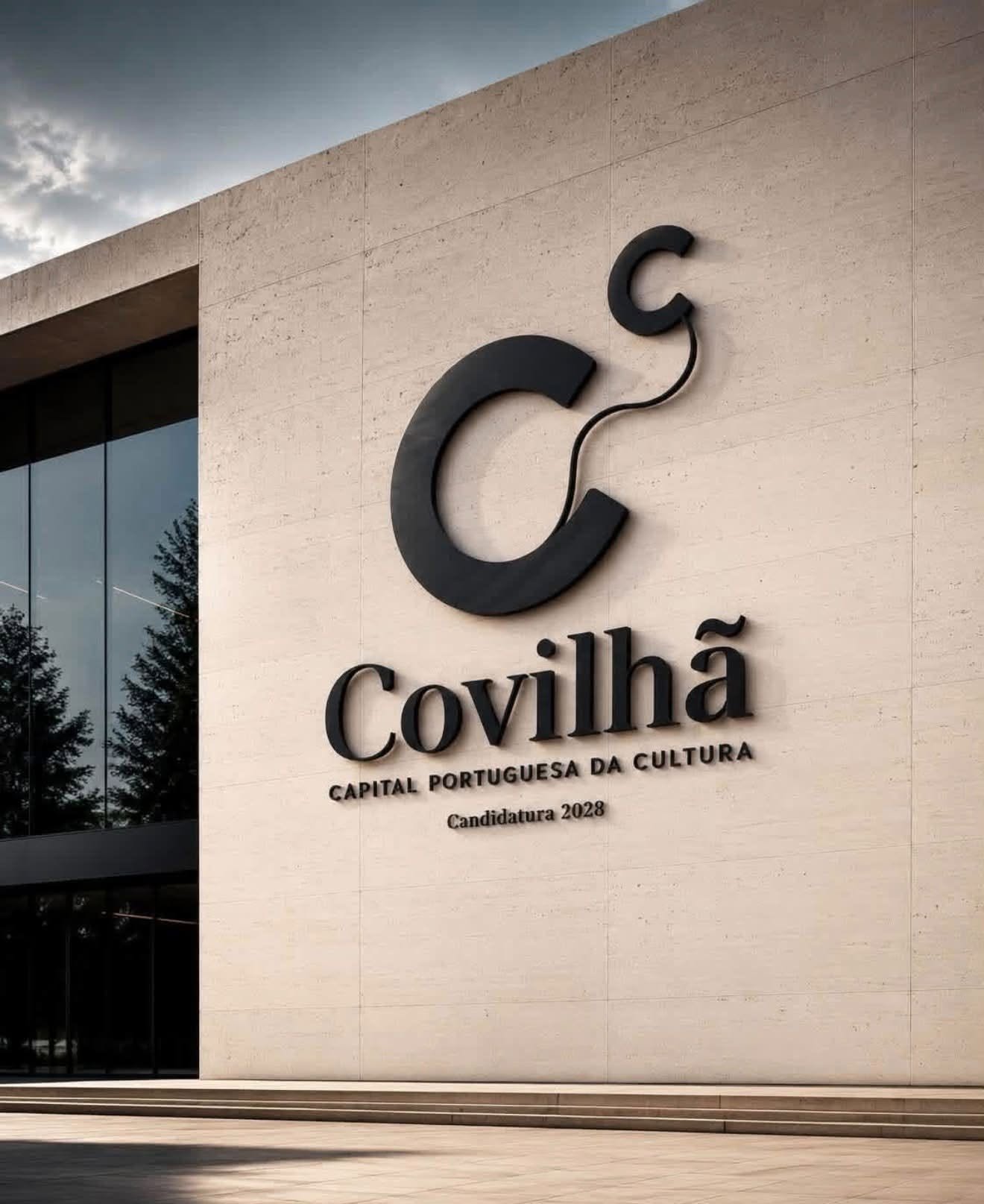
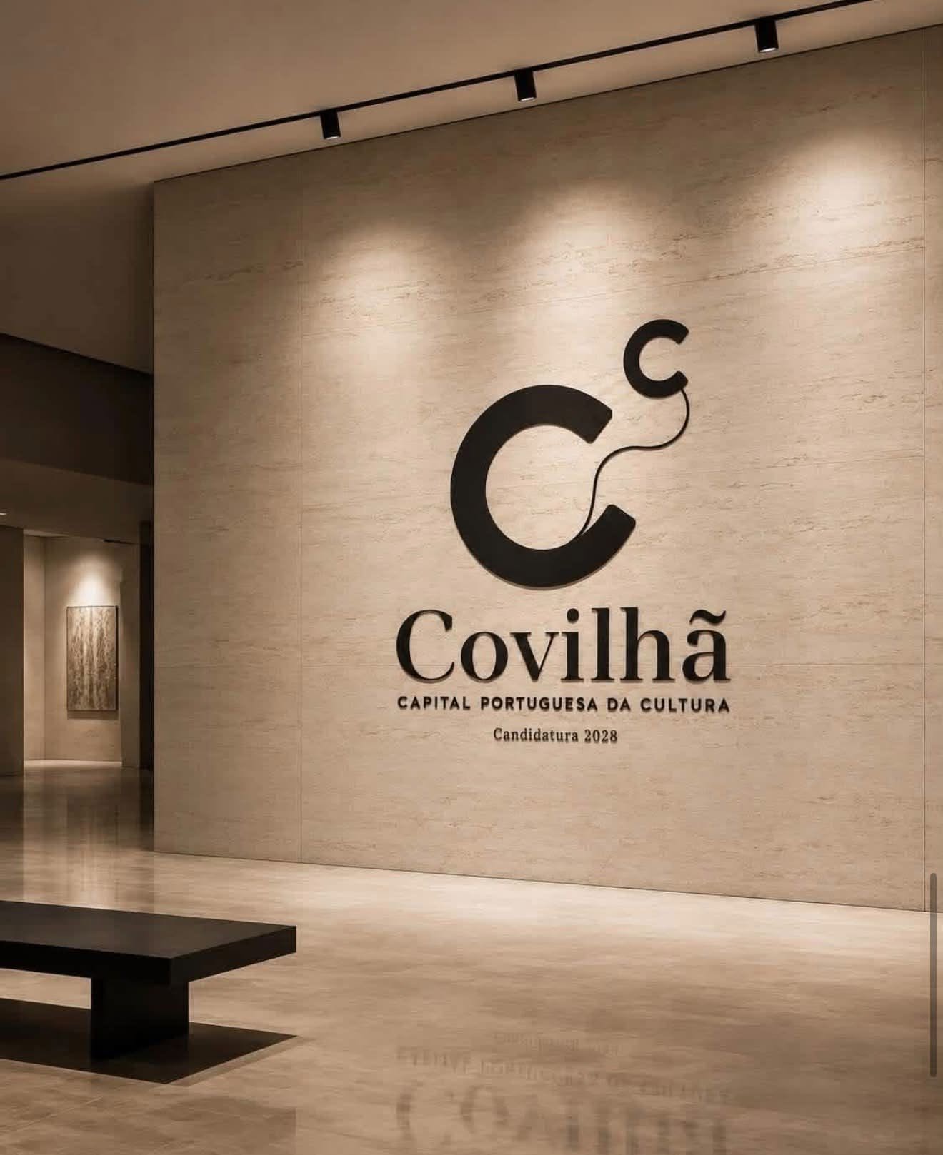
Cᶜ — COVILHÃ TO THE POWER OF CULTURE
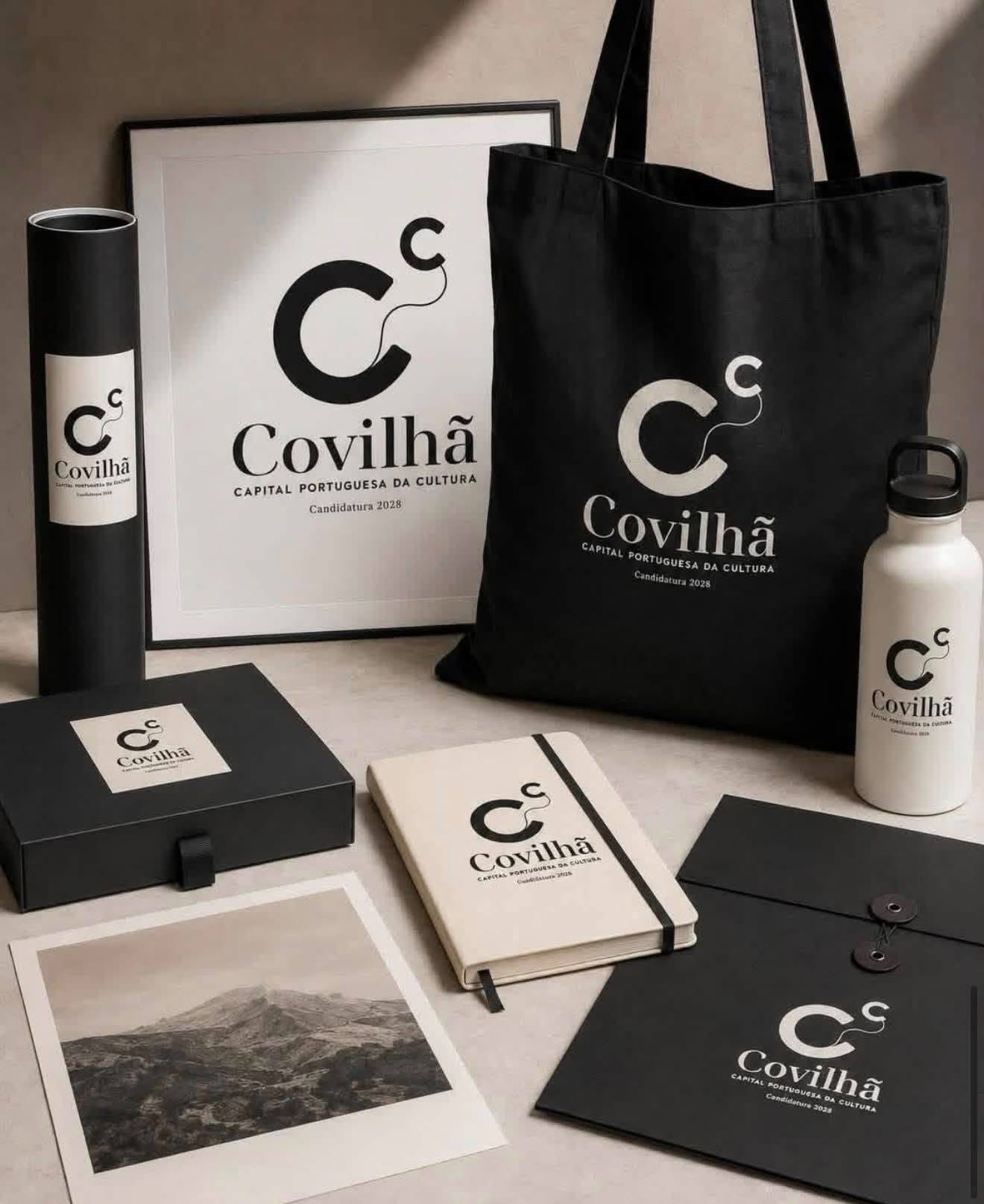
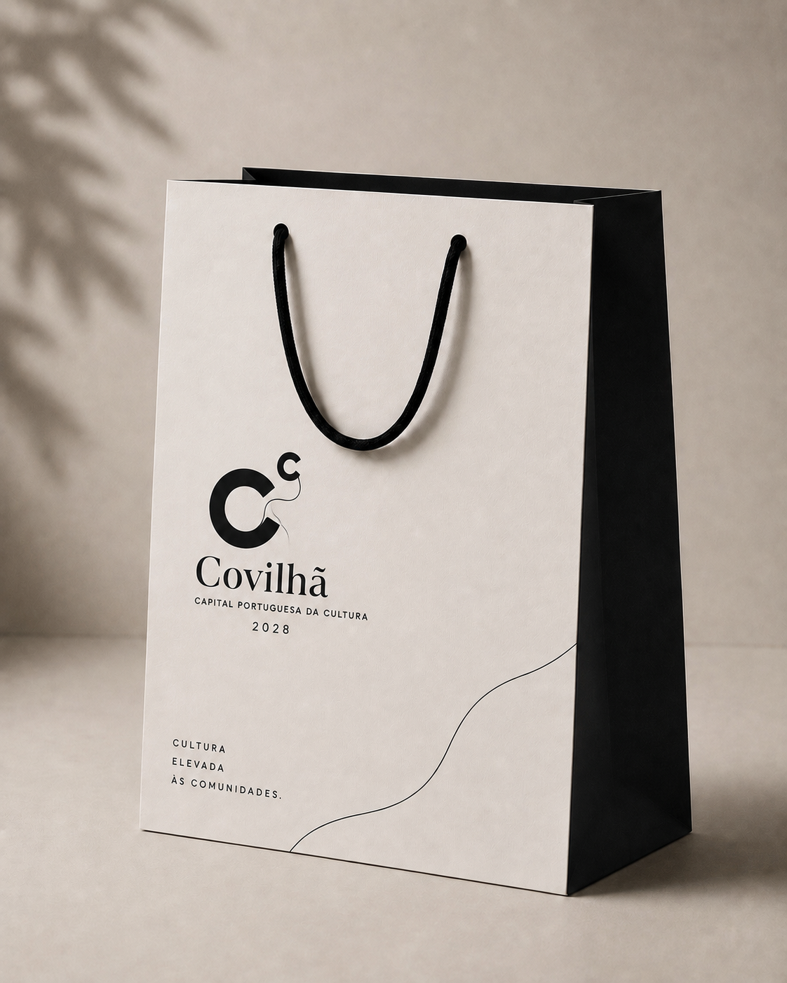
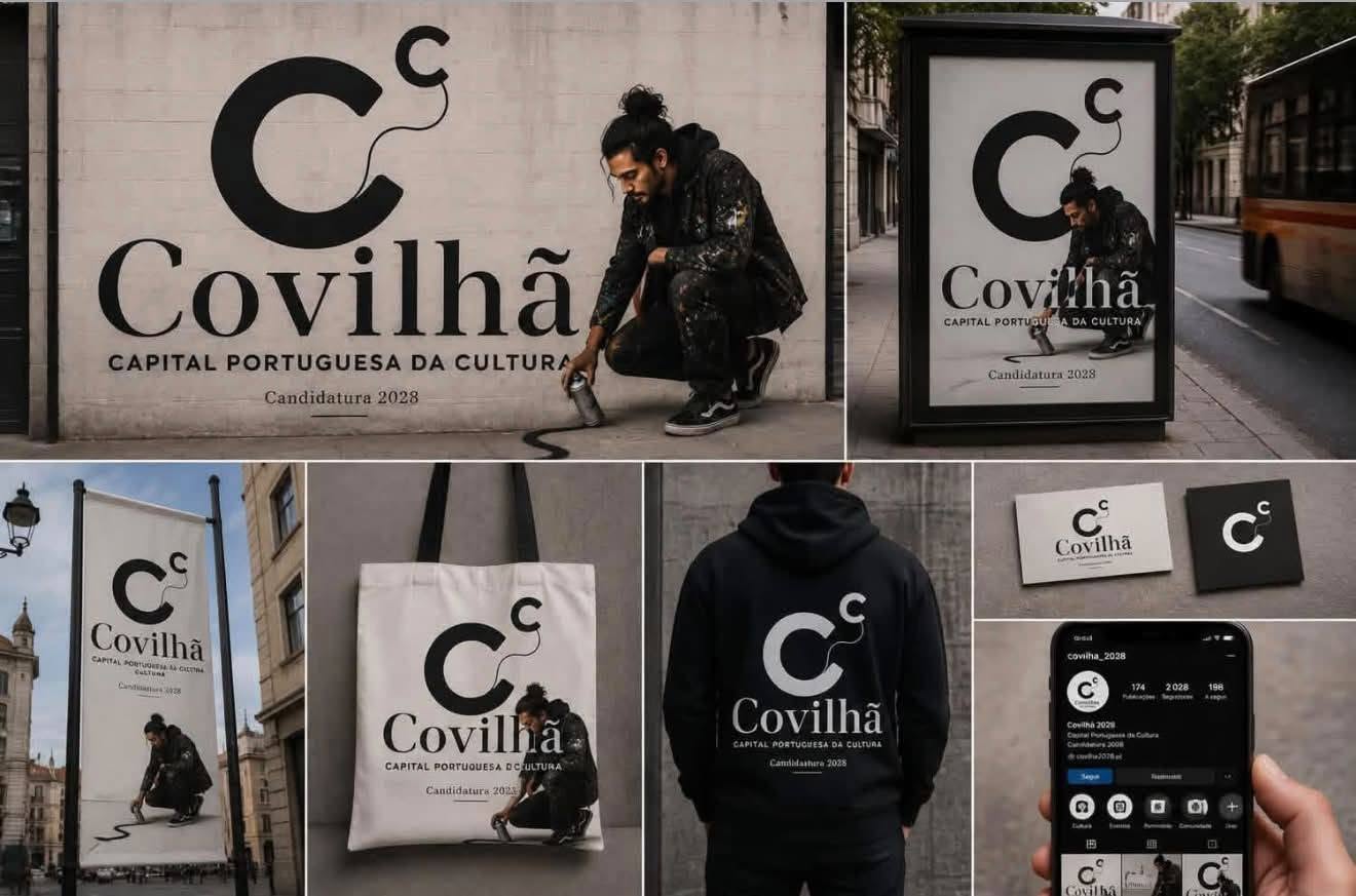
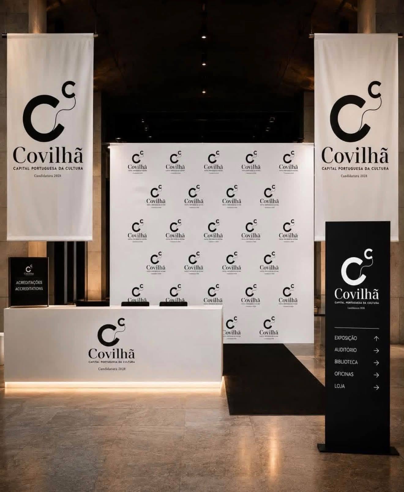
Lobby created the identity for Covilhã’s bid to become Portuguese Capital of Culture 2028.
We began with a simple idea: what if Culture could, quite literally, elevate a city?
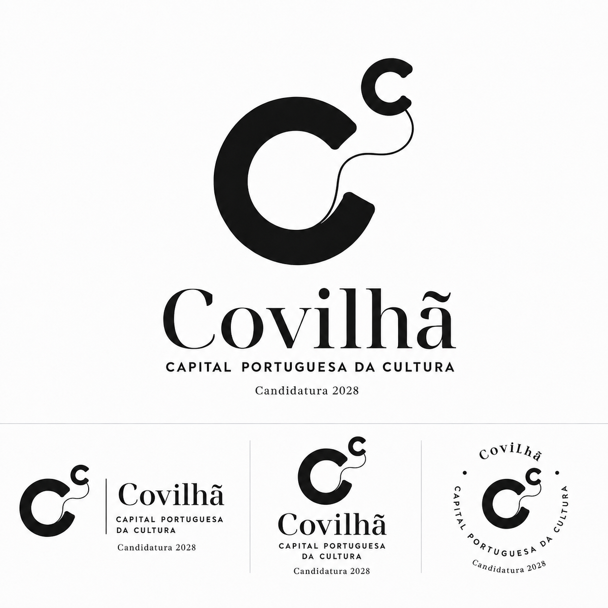
From mathematics came Cᶜ — the C of Covilhã raised to the power of the C of Culture.
In mathematics, raising a number to a power means multiplying it by itself to produce a new result. This idea of power and transformation lies at the heart of the brand.
Culture as a force that unlocks Covilhã’s potential. That elevates, transforms and amplifies the city, taking it into a new dimension.
The mathematical language adds further layers to the identity: precision, knowledge, innovation, technology and the future. The two Cs also expand its meaning: Covilhã, Culture, Capital, Creativity and Community.
A rising thread runs through the symbol’s geometric precision, connecting the two Cs.
It represents human connection, community, flow and digital connectivity. It is also a direct reference to woollen yarn, a material deeply woven into Covilhã’s history and identity.
This meeting point gives the brand its strength: precision and emotion, heritage and the future, human and digital, tradition and innovation.
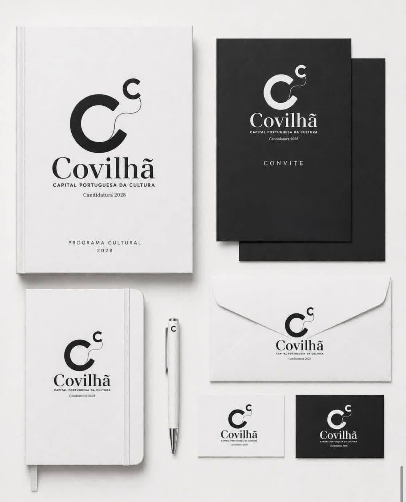
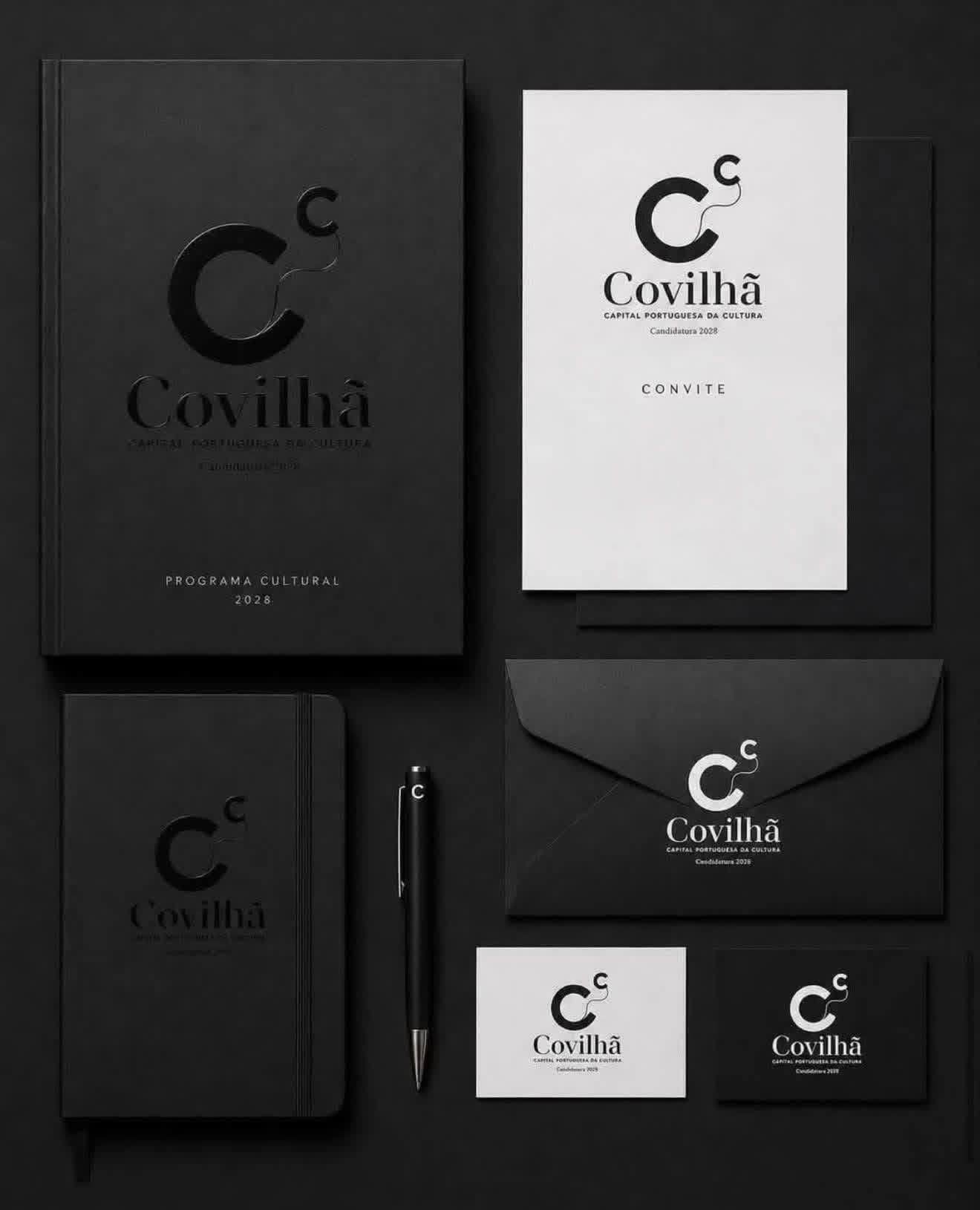
Black and white is also a conceptual choice. We did not want to decide what colour Culture should be.
The logo does not compete with Culture. It gives it space.
People, artists, works, places, events and communities will bring it colour and life throughout the bid.
An identity designed to be simple, recognisable and open, equally at home in the city and in the digital world.
Covilhã to the power of Culture.
Culture to the power of communities.
Client
Covilhã Municipality
Agency
Lobby Films and Advertising
Date
20 de September, 2026
You may also like this